library(ggplot2)
library(tidyverse)
library(reshape2)
library(RColorBrewer)
clinical.df=data.frame(
patient=paste("P",seq(1:15),sep = ""),
gender=sample(c("male","female"),15,replace = T),
symptom=sample(c("mild","moderate","severe"),15,replace = T),
RNAseq=sample(c("yes","no"),15,replace = T),
WES=sample(c("yes","no"),15,replace = T)
)
clinical.df1=data.frame(
patient=paste("P",seq(1:15),sep = ""),
age=sample(20:80,15,replace = T)
)
clinical.df4=data.frame(
patient=paste("P",seq(1:15),sep = ""),
age0=sample(30:100,15,replace = T)
)
clinical.df2=melt(clinical.df,id="patient")
clinical.df3=melt(clinical.df1,id="patient")
clinical.df5=melt(clinical.df4,id="patient")
cols=c(
"level1"="#E5F5E0","level2"="#A1D99B","level3"="#41AB5D",
"male"="#66C2A5","female"="#FC8D62",
"mild"="#377EB8","moderate"="#FFFF33","severe"="#E41A1C",
"yes"="black","no"="lightgrey"
)
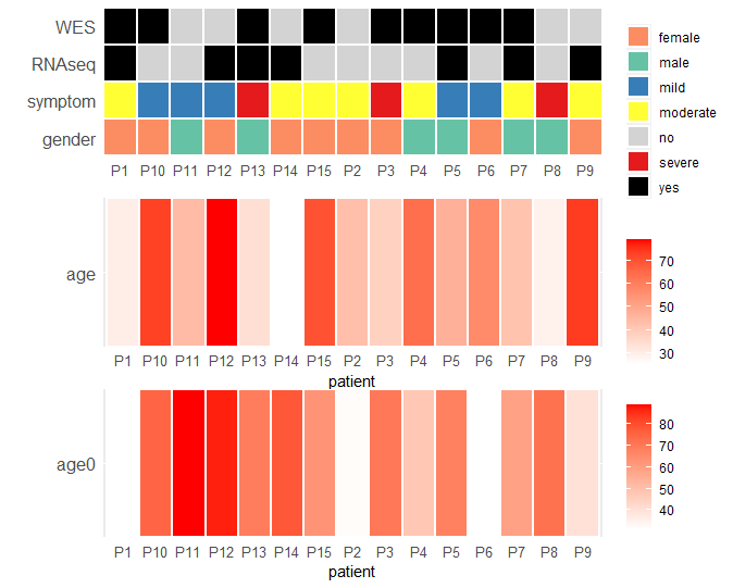
p1 <- clinical.df2%>%ggplot(aes(x=patient,y=variable))+
geom_tile(aes(fill=value),color="white",size=1)+ #color和size分别指定方块边线的颜色和粗细
scale_x_discrete("",expand = c(0,0))+ #不显示横纵轴的label文本;画板不延长
scale_y_discrete("",expand = c(0,0))+
scale_fill_manual(values = cols)+ #指定自定义的颜色
theme(
axis.text.x.bottom = element_text(size=10),axis.text.y.left = element_text(size = 12), #修改坐标轴文本大小
axis.ticks = element_blank(), #不显示坐标轴刻度
legend.title = element_blank() #不显示图例title
)
p2 <- clinical.df3%>%ggplot(aes(x=patient,y=variable))+
geom_tile(aes(fill=value),color="white",size=1)+ #color和size分别指定方块边线的颜色和粗细
scale_x_discrete("",expand = c(0,0))+ #不显示横纵轴的label文本;画板不延长
scale_y_discrete("",expand = c(0,0))+
scale_fill_gradient(low = "white", high = "red",breaks=seq(30,90,10))+ #指定自定义的颜色
theme(
axis.text.x.bottom = element_text(size=10),axis.text.y.left = element_text(size = 12), #修改坐标轴文本大小
axis.ticks = element_blank(), #不显示坐标轴刻度
legend.title = element_blank() #不显示图例title
)
p3 <- clinical.df5%>%ggplot(aes(x=patient,y=variable))+
geom_tile(aes(fill=value),color="white",size=1)+ #color和size分别指定方块边线的颜色和粗细
scale_x_discrete("",expand = c(0,0))+ #不显示横纵轴的label文本;画板不延长
scale_y_discrete("",expand = c(0,0))+
scale_fill_gradient(low = "white", high = "red",breaks=seq(30,90,10))+ #指定自定义的颜色
theme(
axis.text.x.bottom = element_text(size=10),axis.text.y.left = element_text(size = 12), #修改坐标轴文本大小
axis.ticks = element_blank(), #不显示坐标轴刻度
legend.title = element_blank() #不显示图例title
)
p3
p2
p1
library('aplot')
p1%>%insert_bottom(p2)%>%insert_bottom(p3)